haotu : an open lab notebook

2017/07/18

Make ggplot look like base plot in R

Filed under: ggplot, R, R graphics — Tags: , , , , , , — S @ 04:46
myplot + theme_bw() + theme(panel.border = element_blank(), panel.grid.major = element_blank(), panel.grid.minor = element_blank(), axis.line = element_line(colour = "black"))
myplot + theme_bw() + theme(panel.grid.major = element_blank(), panel.grid.minor = element_blank(), axis.line = element_line(colour = "black"))

here


2016/04/19

get latitude longitude raster cells

Filed under: R, R graphics, R spatial, Uncategorized — S @ 07:46
rasterToPoints(stacked) #this also gives the cell values of the raster layer or layers

http://gis.stackexchange.com/questions/142156/r-how-to-get-latitudes-and-longitudes-from-a-rasterlayer


number of layers in raster stack

Filed under: R, R graphics, R spatial, R Stats, Uncategorized — S @ 07:08
dimension(stacked)[3]

2014/08/25

plot rho correlation in R

Filed under: R, R graphics, R Stats — S @ 13:28
cr<-round(cor(a.ran)[2,1],3)
text(.2,-.4,bquote(rho == .(cr)),cex=2)

Order Boxplot in R

Filed under: R, R graphics, R Stats — S @ 11:58
boxplot() 

I have found that this plotting function orders boxes in alphabetical order, at times, so if I want a particular order that the R god is not giving me, then I find it easiest to rename my categories in an alphabetical order in which I want plotted and then us the names argument to relabel the x-axis.  


2013/11/07

Google Chart Tools in R

Filed under: Google, Google Docs, Manipulate Data in R, R, R, R graphics — S @ 03:21

There is a nice R package googleVis that integrates google motion charts and chart tools with R

A tutorial here

2013/08/27

Add a vertical line to a histogram in R

Filed under: R, R graphics — S @ 02:10


hist(x)
abline(v = mx, col = "blue", lwd = 2)

http://stackoverflow.com/questions/6557977/add-mean-value-to-histogram-in-r

2013/07/09

Angle axis x labels on R plot

Filed under: R, R graphics — S @ 04:13

1. First make a plot without the axis you want using xaxt="n":

plot(yy,xx,xaxt="n",xlab="")

2. Then add the axis without labels

axis(side=1,at=xx,labels=FALSE)

where:
side = 1 (this example is for adding labels to the x axis)

3. Finally add the text:

text(xx,par("usr")[3] - ofst, srt = g, adj = 1,labels=labs,xpd = TRUE)

where:
par("usr")[3] gives you the y coordinate for your x axis
ofst is the offset at which you want to plot the labels away from the x axis (note the minus sign).
srt = g this gives the angle to plot the labels, I like (e.g., g = 45)
labs is a vector of your labels
xpd=TRUE plotting clipped to the figure region, also try xpd=NA
2013/01/30

plot plots next to each other in R: manipulate white space around R produced graphics

Filed under: R, R graphics — S @ 06:04

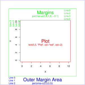
Many times I need to make a figure for a paper with multiple panels. What I do is line up the panels such that I can remove axes labels when side-by-side.

Then I manipulate the white space using the par function. There is a nice figure here that describes the proper arguments With the code that produces it.

The image is reproduced below

rmargins_sf

2012/09/28

R abline control length

Filed under: R, R graphics — S @ 00:12

It is nice to plot regression lines that are not infinite like what abline gives, a line that spans the range of the data.


fline <- function(object) {
# ``fline'' <--> fitted line.
r <- range(object$model[,2])
d <- data.frame(r)
names(d) <- attr(object$terms,"term.labels")
y <- predict(object,d)
lines(r,y)
}

From here: https://stat.ethz.ch/pipermail/r-help/2008-June/165288.html

Blog at WordPress.com.